The Marriage Pact Title Treatment
TITLE TREATMENT • LOWER THIRD DESIGN • VISUAL IDENTITY • ART DIRECTION

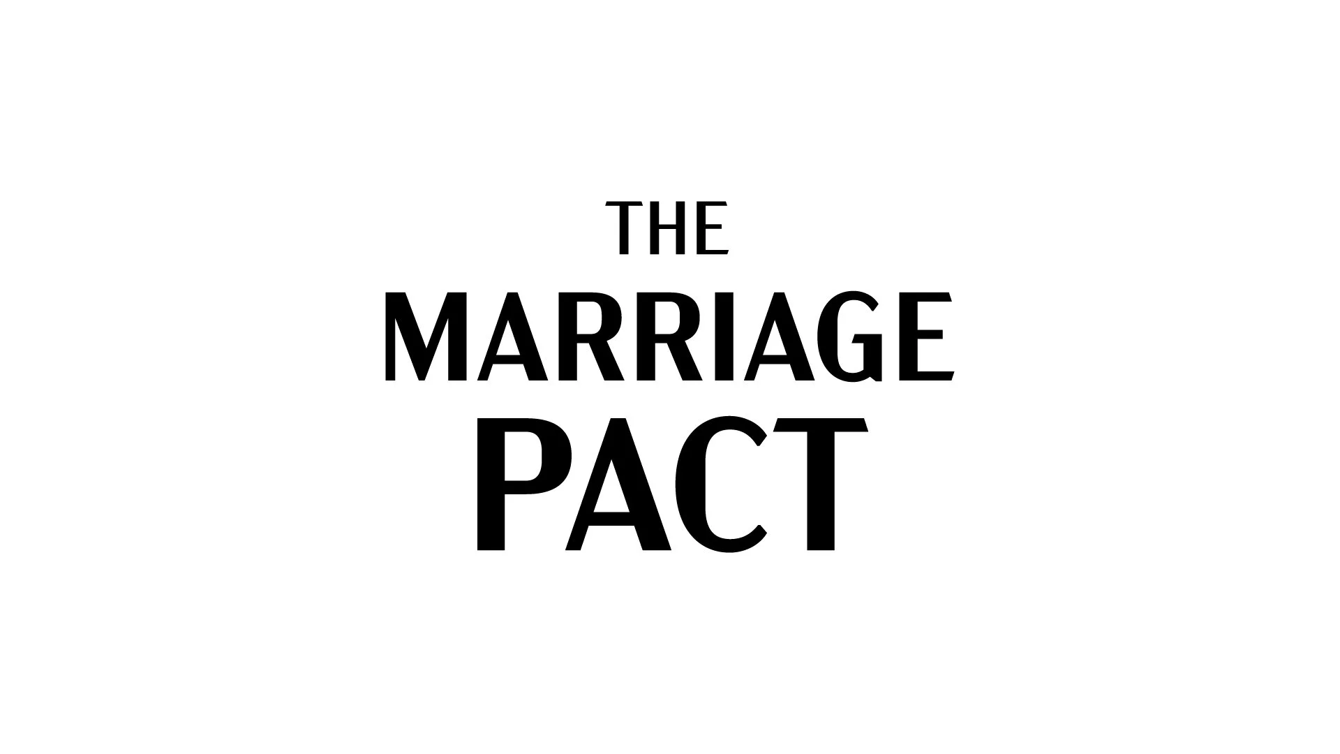
The producers for the Roku show The Marriage Pact had me do some exploration on developing a look for the show’s title treatment and lower third graphics.
We went through a few rounds trying out a few different directions as you can see in the progression below. Unfortunately they didn’t end up selecting any of the work, but I still enjoyed the work and now that the show is released, I’m able to share it here with you now.
Art Deco and “Human” Directions
They wanted the graphics package to be elegant and sophisticated so we started down an art deco-styled path for one direction, while also exploring a more “human” touch with the pact signature “scribble” in the other for these initial ideas.


These are some of the initial animation examples I developed for the titles and lower thirds.
Handwritten Approaches
We also looked at doing something with a handwritten style so I explored some literal interpretations of a marriage pact, by showing the title as a signature on a contract as well as trying out an animation test of using different handwriting scripts to try to represent the different participants who were signing pacts, and how each of their signatures would look different.


Refining the Ideas
We continued down the handwritten path, but strayed from it being so literal and started to focus on more abstract backgrounds and subtle movements in the animation.


Animation Experiments
The videos below are some explorations that weren’t considered, but I liked how they turned out so I wanted to be sure to include them here to give a sense of the scope of what I looked at when considering the graphics for this show.
The animated lines crossing in the background represent the strokes of the show’s participants’ signatures.
An homage to Catch Me if You Can that was requested. While I like this animation, it ultimately wasn’t appropriate for the vibe of the show.
Another ask to bring hearts into the animation that didn’t quite work, but I did like the styling on this one.