Titans of Mavericks
BRANDING & VISUAL IDENTITY • LOGO DESIGN • ART DIRECTION • PRINT DESIGN • APPAREL DESIGN • ENVIRONMENTAL GRAPHICS • WEBSITE DESIGN
TITANS OF MAVERICKS is the world’s premiere, high adrenaline, big wave surfing event. This one-day, invitation-only surfing competition is held at the legendary Mavericks surf break located near Half Moon Bay, only 20 minutes south of San Francisco and near the heart of California’s Silicon Valley. The 24 Titans compete at the highest level of skill, risk and athleticism to stand out and challenge the massive swells on the biggest day of the winter season.
I worked closely with Cartel Management to develop the new branding and identity of the renamed event. Our ultimate goal was to create a sophisticated and modern look that stood in stark contrast when compared to similar events, but also helped raise the profiles of the athletes competing in the event. The brand is as much about the strength and power of the competitors involved as it is the power of the waves they surf every day.
“...headed in the right direction with a re-branding that included high-end video production, a modern website and marketing that embraced the anecdotes and characters surrounding the storied surf spot. Cartel put local surfers on a pedestal.”
The brand's color scheme utilizes two main colors: Mavericks Blue and Mavericks Red. Mavericks Blue represents the ocean waters that the competitors need to conquer in order to become a Titan while Mavericks Red represents the strength, energy and determination of those involved. There are additional supporting colors, but Mavericks Blue and Red are the base for the entire brand's look and feel.
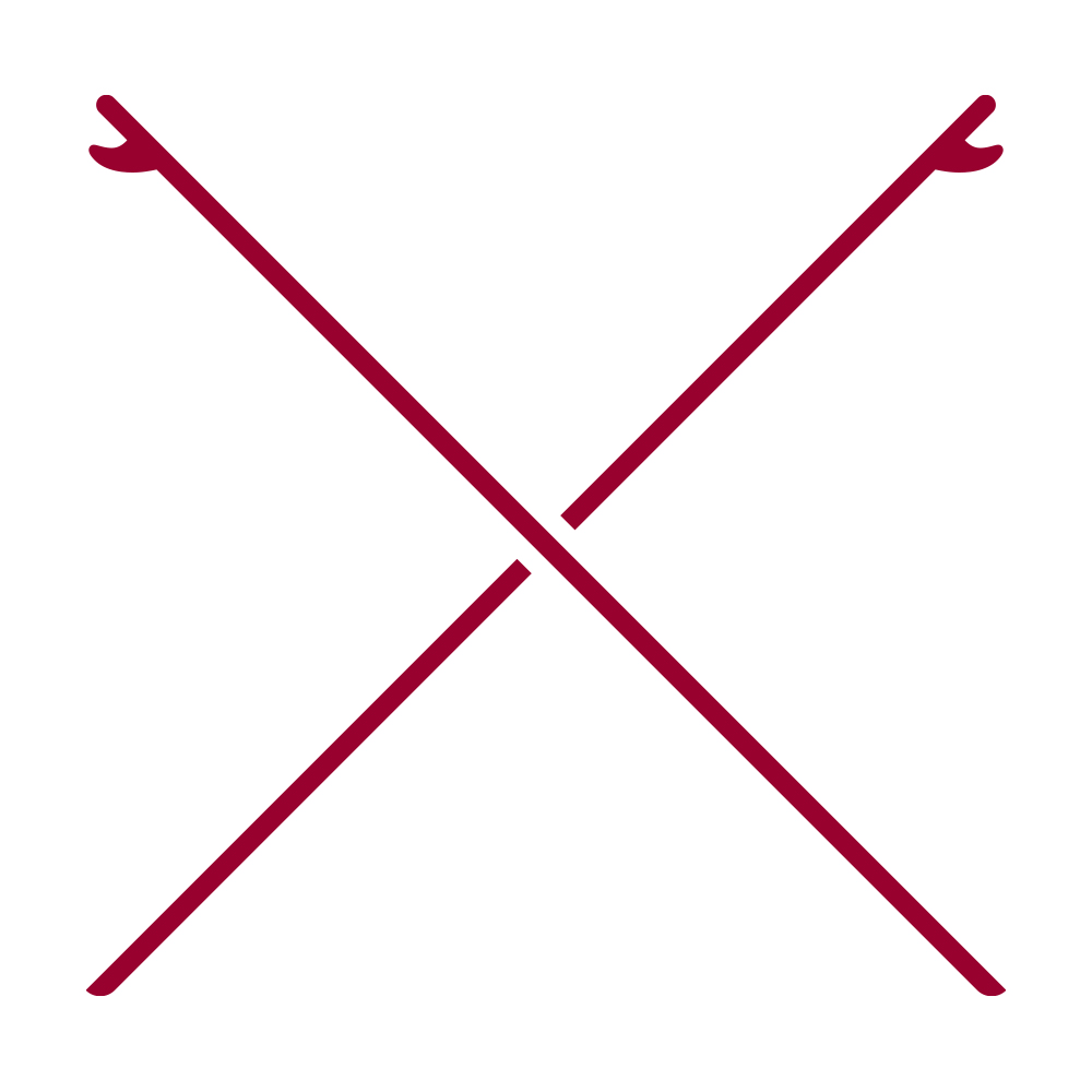
The "Crossed Boards" mark is a simple and strong symbol for big wave surfing. Both boards follow the steep angle that the competitors commit to when they drop into a wave – whether they're choosing to go right or the more harrowing left.
Primary Mark: The Crossed Boards
The secondary marks each have their own story: The Rock represents the Destination. It's an illustration of Sail Rock – about 1/2 mile beyond the Pillar Point coastline – which overlooks the Mavericks waves. The Dog represents the History of the event which was named after the white-haired German Shepard that followed surfers Alex Matienzo, Jim Thompson & Dick Notmeyer out to the location in the 1960s. In Greek Mythology, Poseidon bent the power of the ocean to his will through a single strike of his trident. The Trident represents the Power of the water in the waves at Mavericks.
Secondary Marks: The Rock / The Dog / The Trident
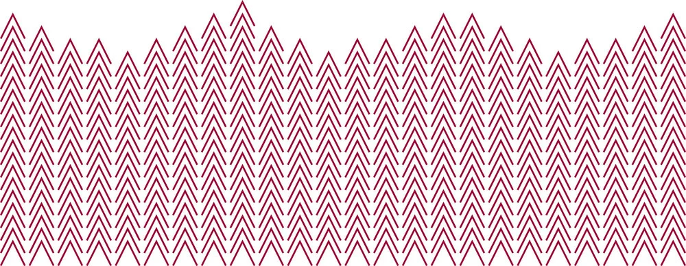
The A WAVE is based on the A from the logotype. All of the elements designed for the brand had to have significance and relevance to the actual event. That's why there are 24 columns, with each column representing one of the 24 competitors in the event. The columns then combine to make an undulating wave, mimicking the incredible strength of the waves they will battle. The last tiny detail: there is one column that is taller than the rest, representing the ultimate victor of the event.
The A Wave
Titans of Mavericks Festival Logo
Committee 5 Logo
Titans of Mavericks Fallen Fund Logo and graphics
A custom version of Gotham was created for Titans of Mavericks to provide a clean, modern, and utilitarian base for all typography related needs for the event. Certain uppercase letters are "stenciled" and the A has had its crossbar removed helping to create the A WAVE graphic. There's also a nice up and down visual connection found between the A and V in MAVERICKS with the crossbar missing.
Website launch announcement
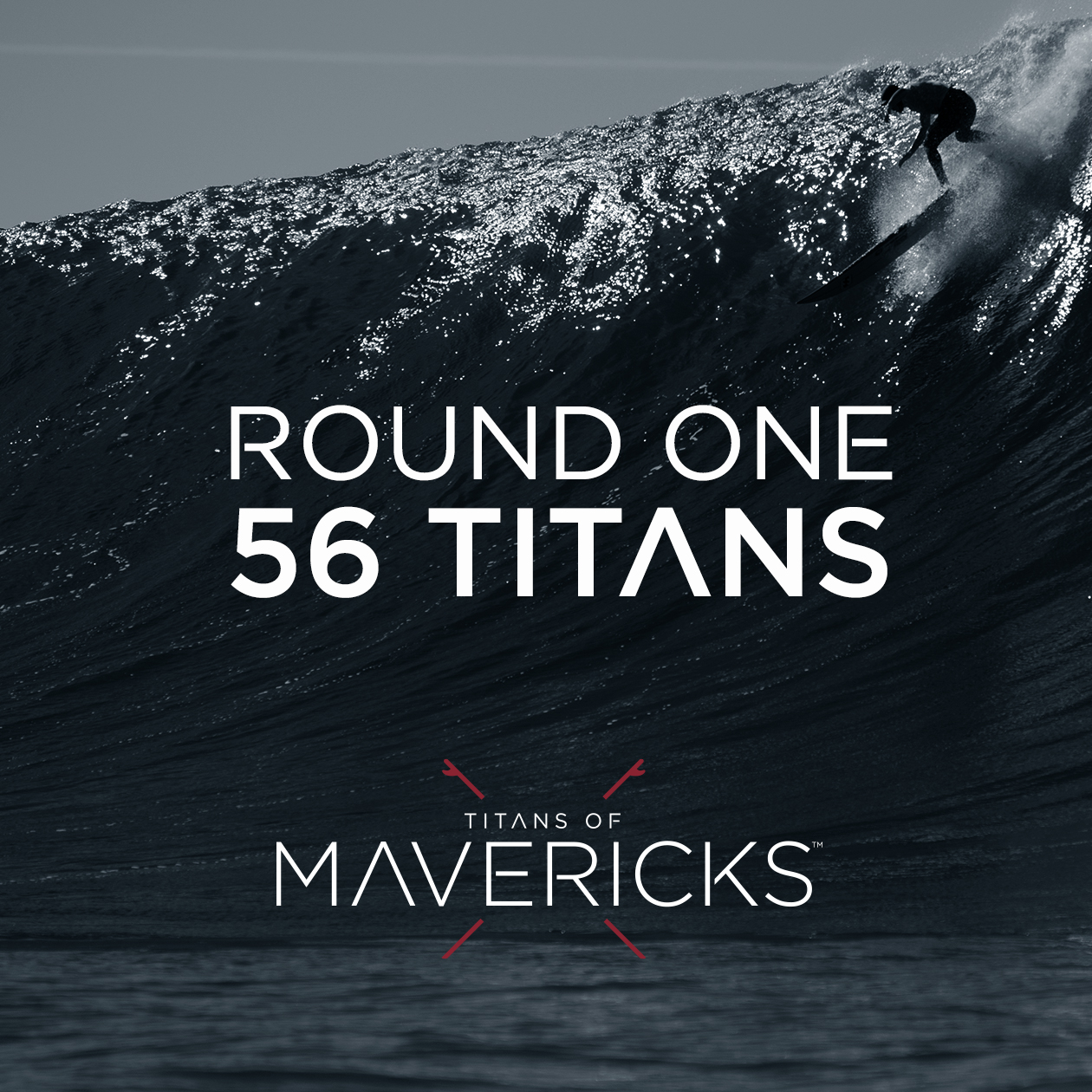
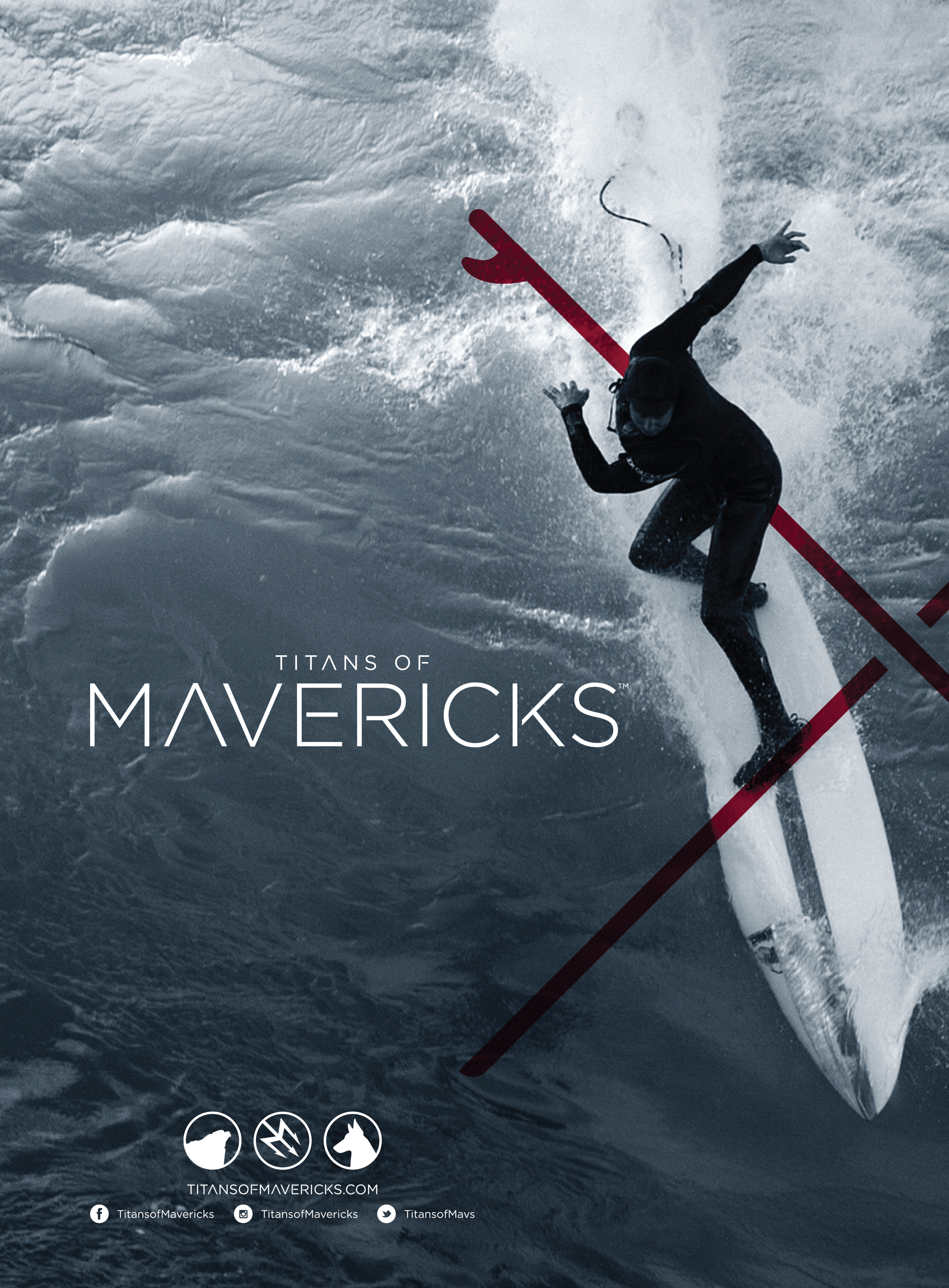
Most of the photography utilizes a one or two color approach to stylize the look of the waves and further connect the photos to the two main brand colors.
Billboard Concept
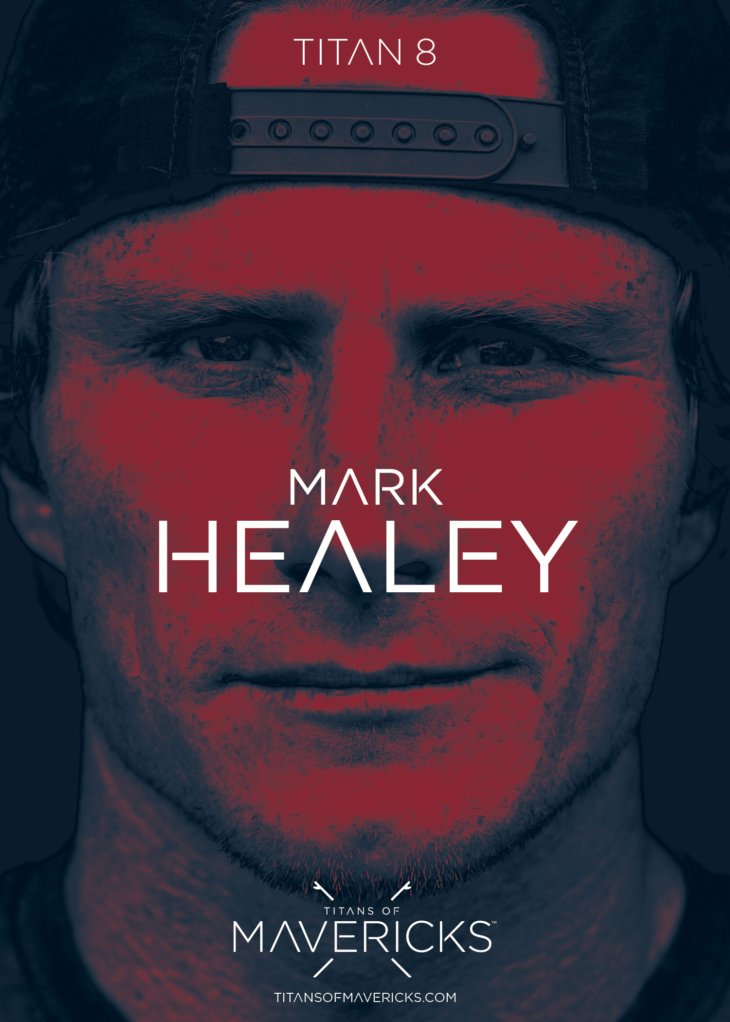
Competitor Poster: Mark Healey
Competitor Poster: Greg Long
Competitor Poster: Shawn Dollar
Competitor Poster: Nic Lamb (2016 Titans of Mavericks Champion)
Competitor Posters
Event Billboard
Social Post
Social Post
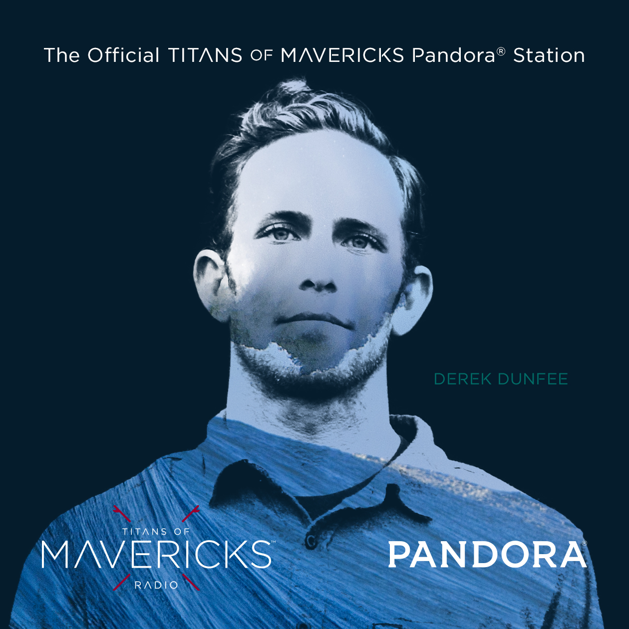
Pandora Radio Promotional Image
Pandora Radio Promotional Image
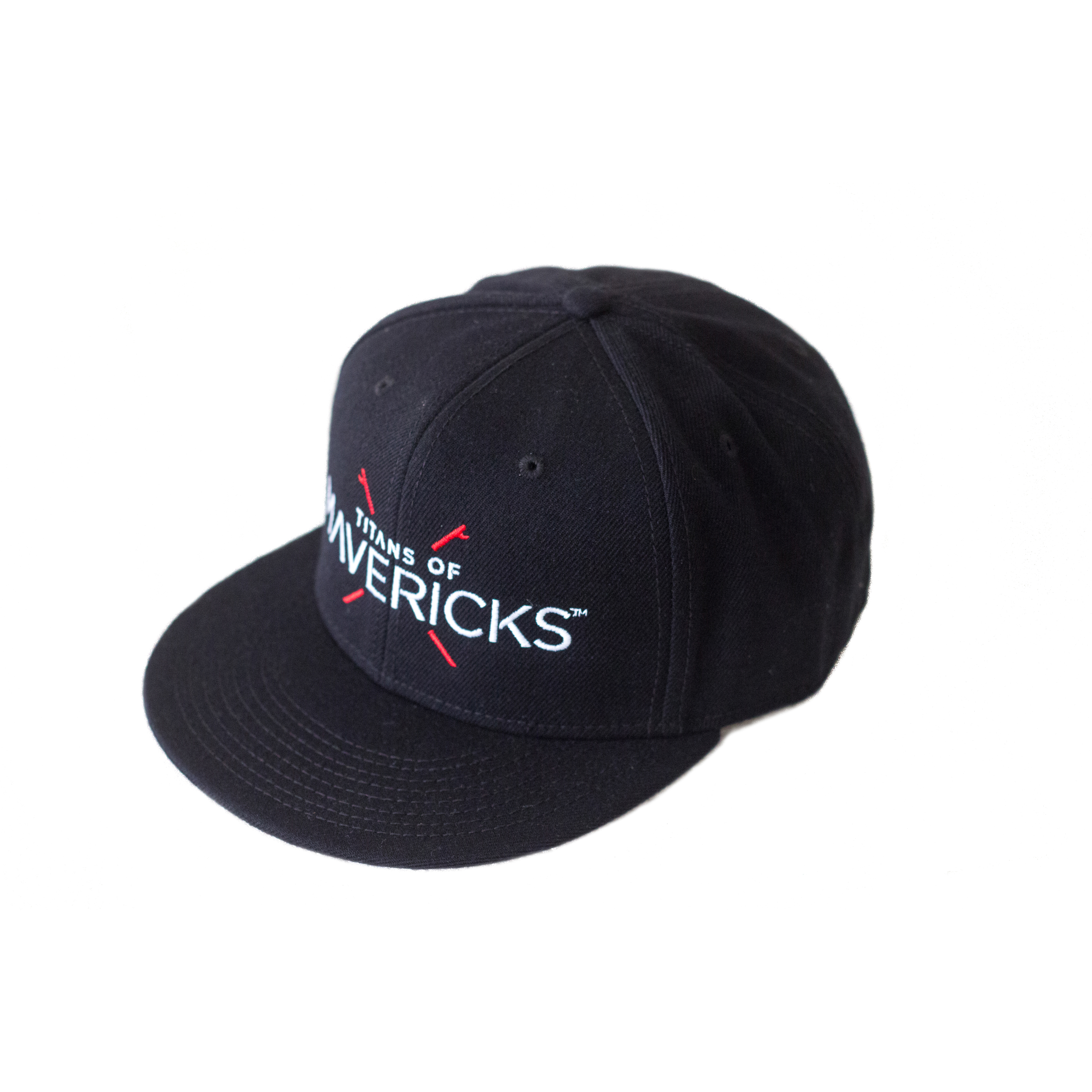
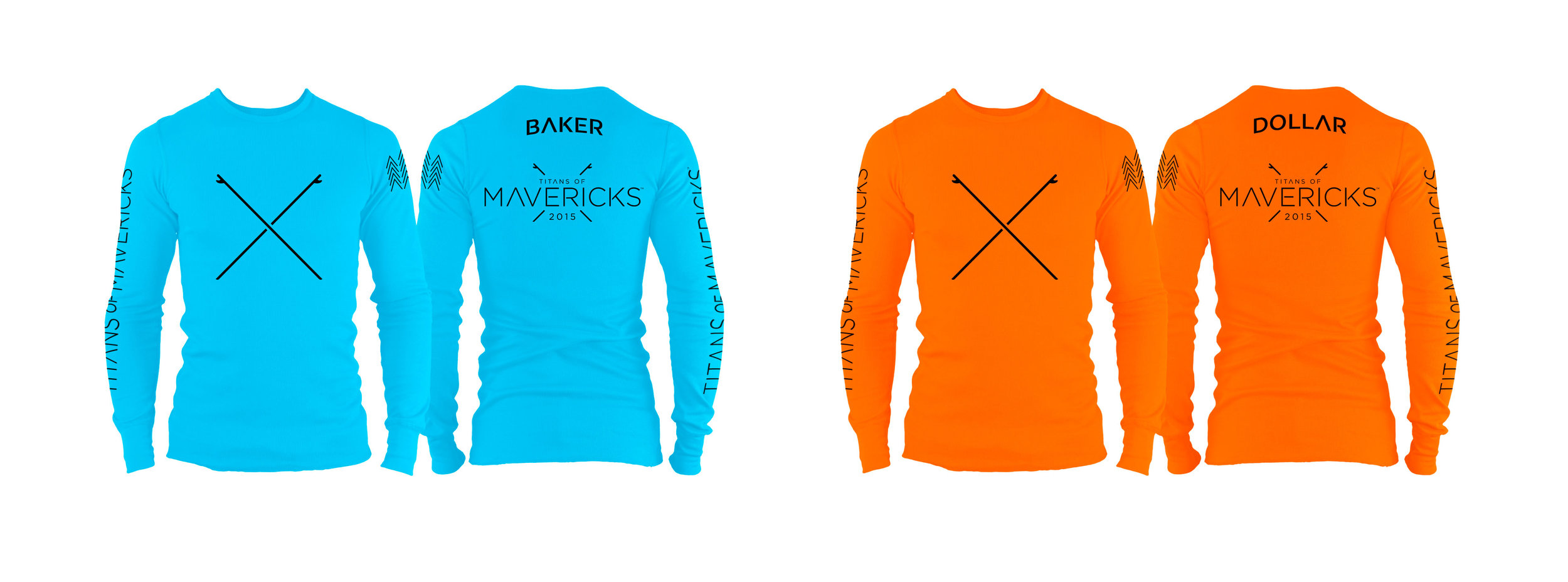
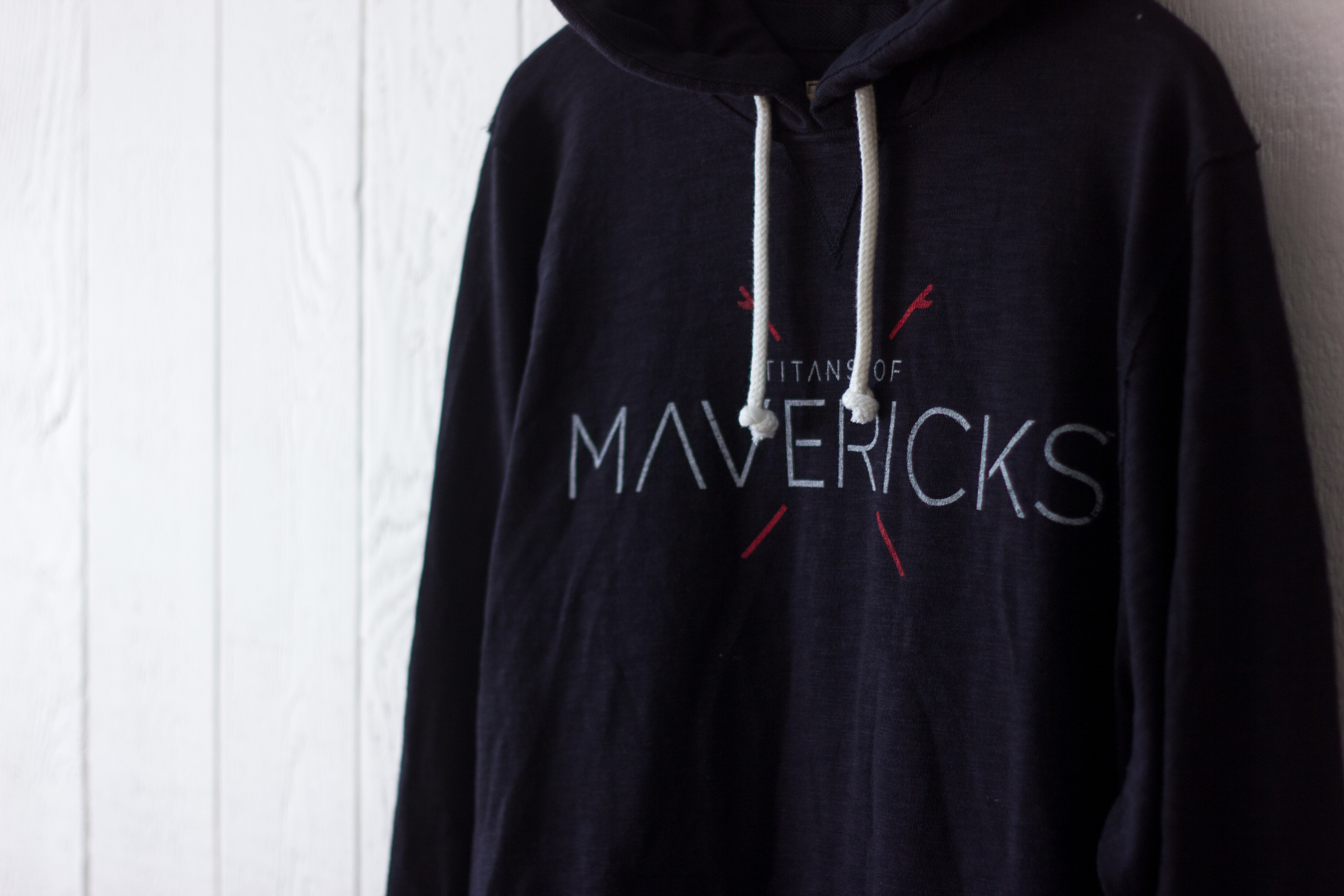
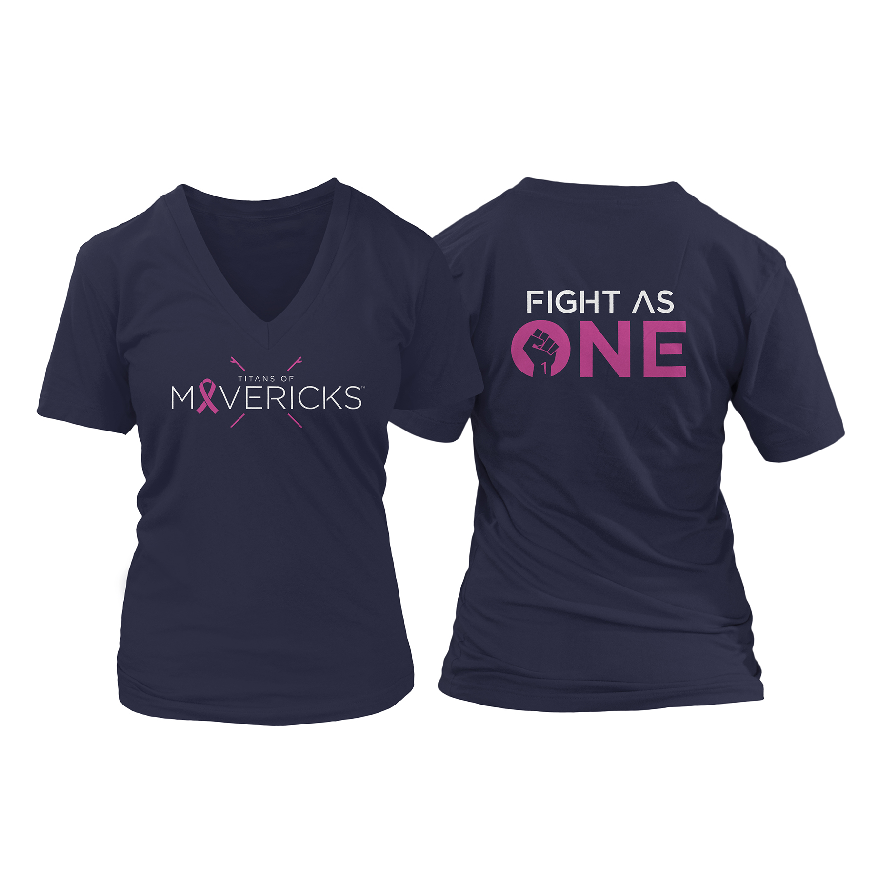
Multiple pieces of event merchandise were designed, ranging from hats, t-shirts, sweatshirts and posters. The designs proved to be very popular and many sold out quickly.
Hat Design
Hat Design
2015/16 Competitor Jersey Design
2015 Event T-Shirt Design
Hooded sweatshirt
Breast Cancer Awareness Month T-Shirts
T-Shirt design for El Niño
Jet Ski Designs
Water Safety Jerseys


