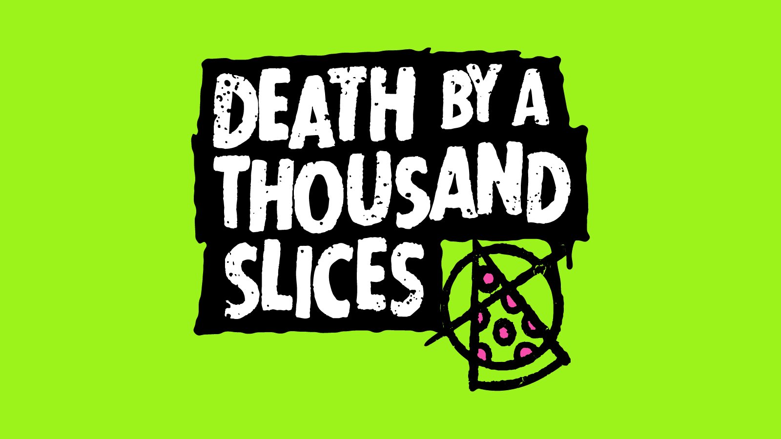
Death By A Thousand Slices
BRANDING & VISUAL IDENTITY • LOGO DESIGN • ART DIRECTION • PRINT DESIGN • APPAREL DESIGN • ENVIRONMENTAL GRAPHICS • CREATIVE EXERCISE
Nobody asked me to design this logo, but I did it anyway. Nobody asked me to work on a project that absolutely doesn’t exist, but I did it anyway. Nobody asked me, but I did it anyway. Why? Because I love to design logos.
Death By A Thousand Slices – Pizza Restaurant
Another industry I’ve yet to tackle in my career - food. Pizza seemed like just the right type of food item to focus on since there’s so much range and personality to be found in a local pizza joint. “Death by a thousand paper cuts” always sounded so torturous, so I decided to flip it a bit and make it “death by” something delicious instead. I’d rather go down slice by slice of pizza than slice by slice of paper.
The name immediately made me think of punk rock for some reason. I had tried a couple of directions that felt a little too uptight for the style but when I loosened up a bit, the ideas flowed. I really ran with the punk approach to the aesthetic for all of the visuals. Then the puns and fun turns of phrase really started coming together for the copy. Messy, dripping pizzas, skulls made out of cheese and some Kruger-inspired type directions really brought the whole idea home. These designs really took me back to the early days of my design career when all I seemed to create were grungy messes - the good kind of mess, of course. If you couldn’t tell, I really enjoyed working on this one.
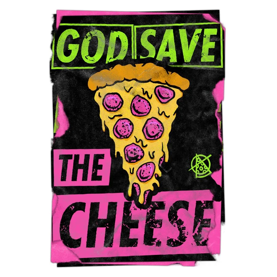
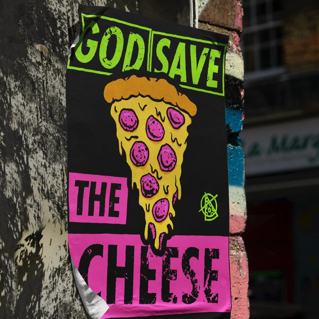
The promotional posters were my favorite part of this project. I tried to come up with as many homages to classic punk as possible. I really like “Never Mind the Olives” for some reason. It’s probably due to my overwhelming distaste of them. “God Save the Cheese” is a fave as well.
Here are some of the store details, including the pizza box packaging design, signage, apparel and other items.
The “Nobody Asked Me” Rules:
I picked a few different product categories and industries, then asked ChatGPT to create company names for each of them and I picked the best one (or combined a few ideas in some cases).
I then had it write up a description about each company and what they offer to give me some guidance. I asked for some keywords and key descriptors to give me a sense of what direction to take the visuals.
I only plan to come up with one design approach per business to keep each project light and easy to manage, but I’m really hoping to challenge myself by building out as many of these “businesses” as possible.


