Love in the Jungle Title Treatment
TITLE TREATMENT • LOWER THIRD DESIGN • VISUAL IDENTITY • ART DIRECTION

The producers of the reality show Love in the Jungle (premiering on Discovery+) approached me about developing a look for their show’s title treatment and lower third graphics. They already had some ideas developed, but wanted to see if I could come up with anything different to provide more options for Discovery+.
They were looking for something that was modern, elegant and sophisticated. The design needed to reflect the “beauty” of the jungle environment they were shooting in, and not the “dirty” elements. It’s a dating show, not a survival show.
I created three different visual directions, all with their own unique look and system. They ultimately ended up using the type treatment from one and the lower third design from the same direction. Now that the show is airing, I want to share some of the different explorations that happened during the project.
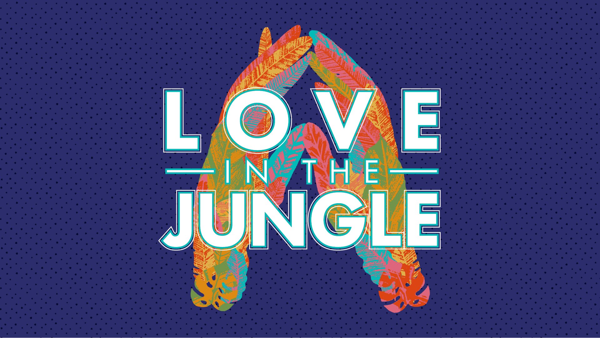
“Lush & Elegant” Title Direction
Dramatic lighting and moody coloring give this jungle view a sense of lush elegance. The title intertwines with the leaves to give it depth. As the title comes into view, there is much more to this jungle than it may initially seem.
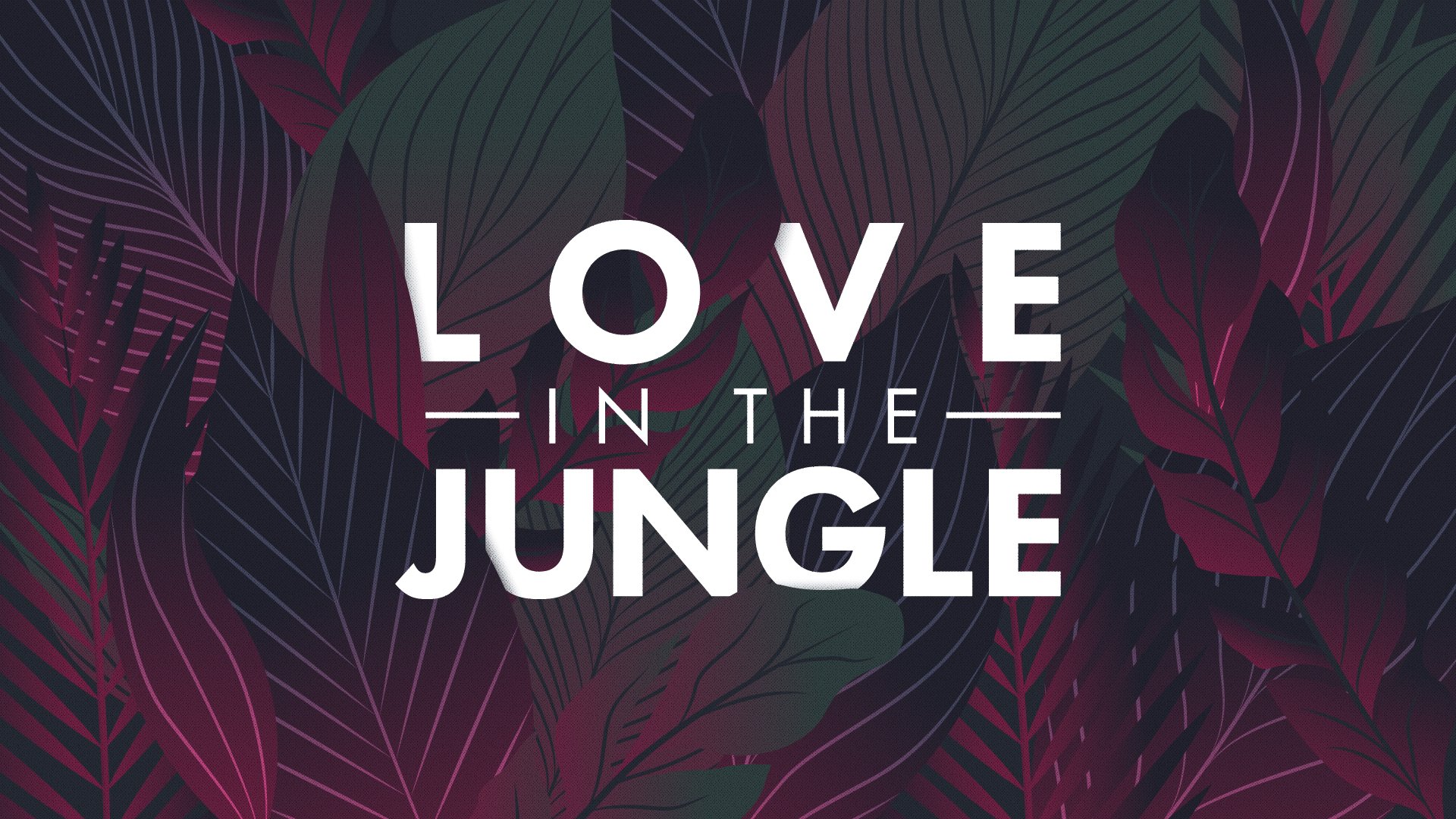
As you can see from above, this is the type treatment they selected. The lush jungle leaves may not have made it into the title, but they were incorporated into the lower third design with a more “earthy” colorway.

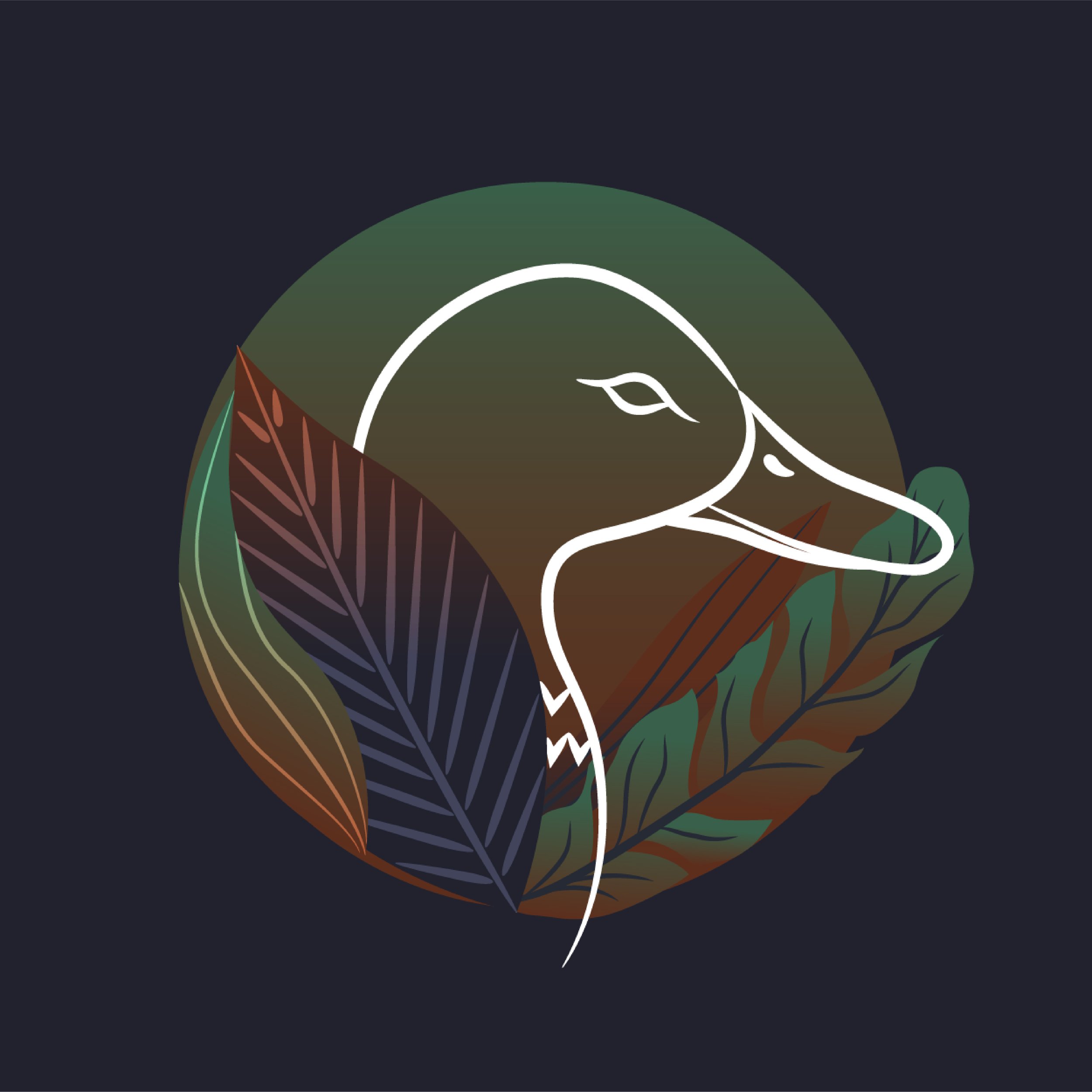
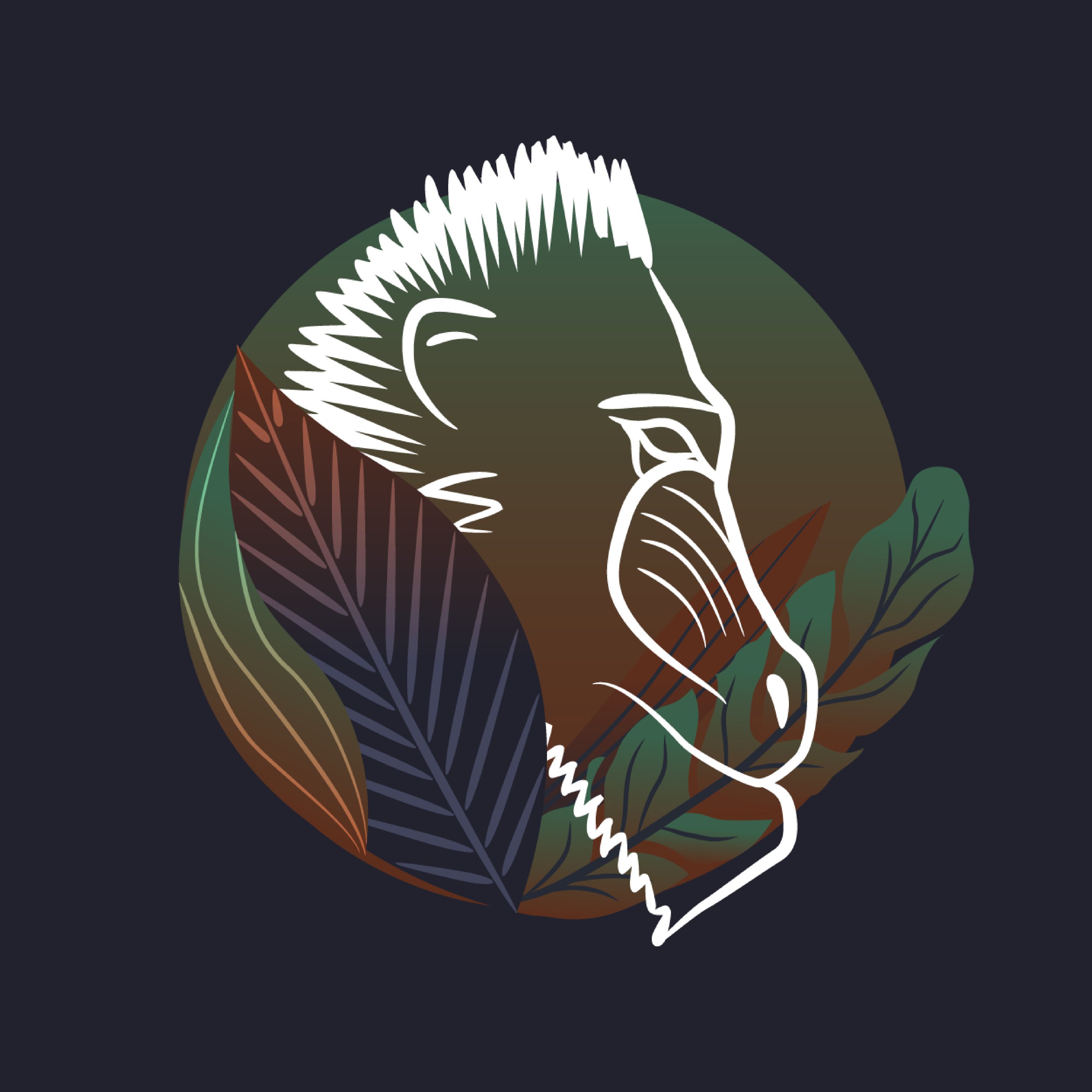
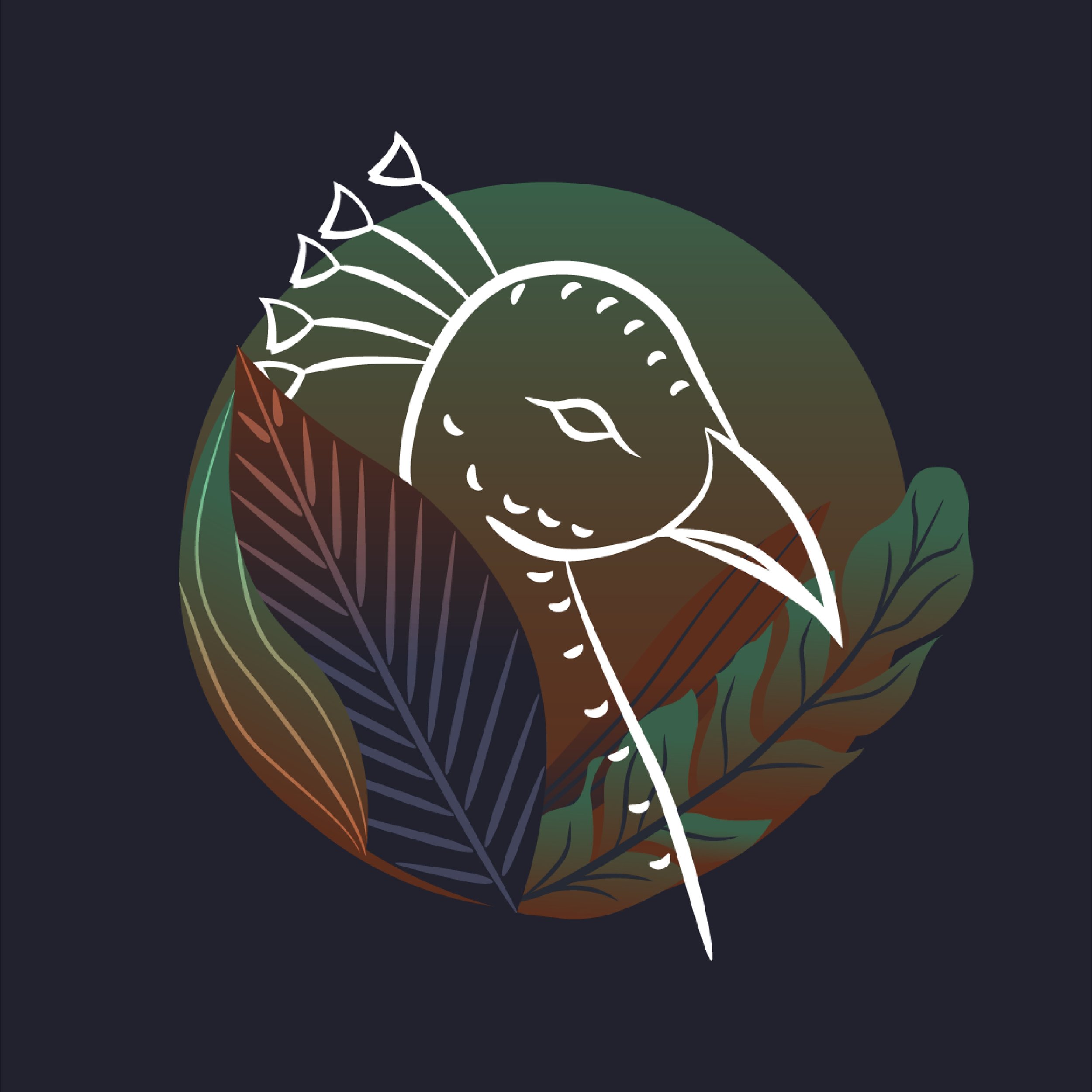
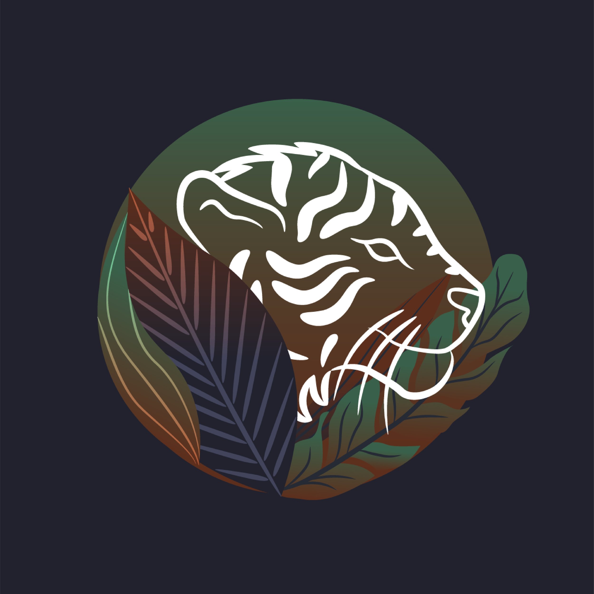
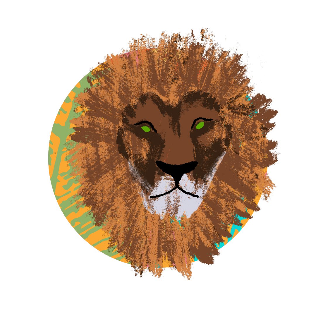
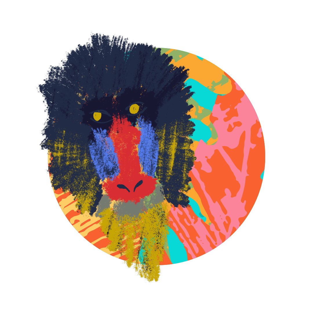
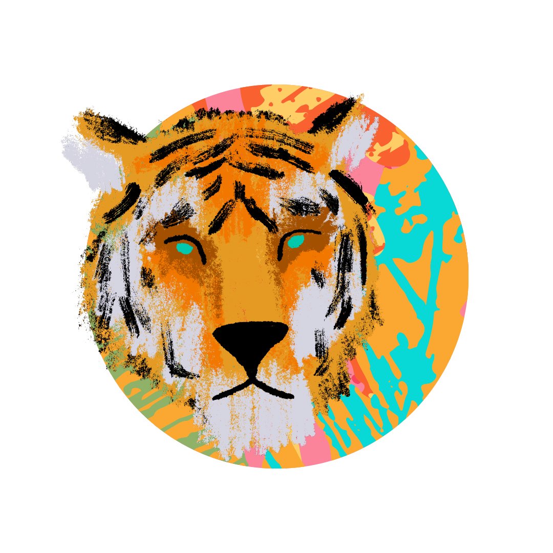
Each cast member is assigned an animal and that animal is attached to their name during their confessionals on the show. These are all of the animal icons that were created.
Broadcast lower third animation.
“Fiery” Title Direction
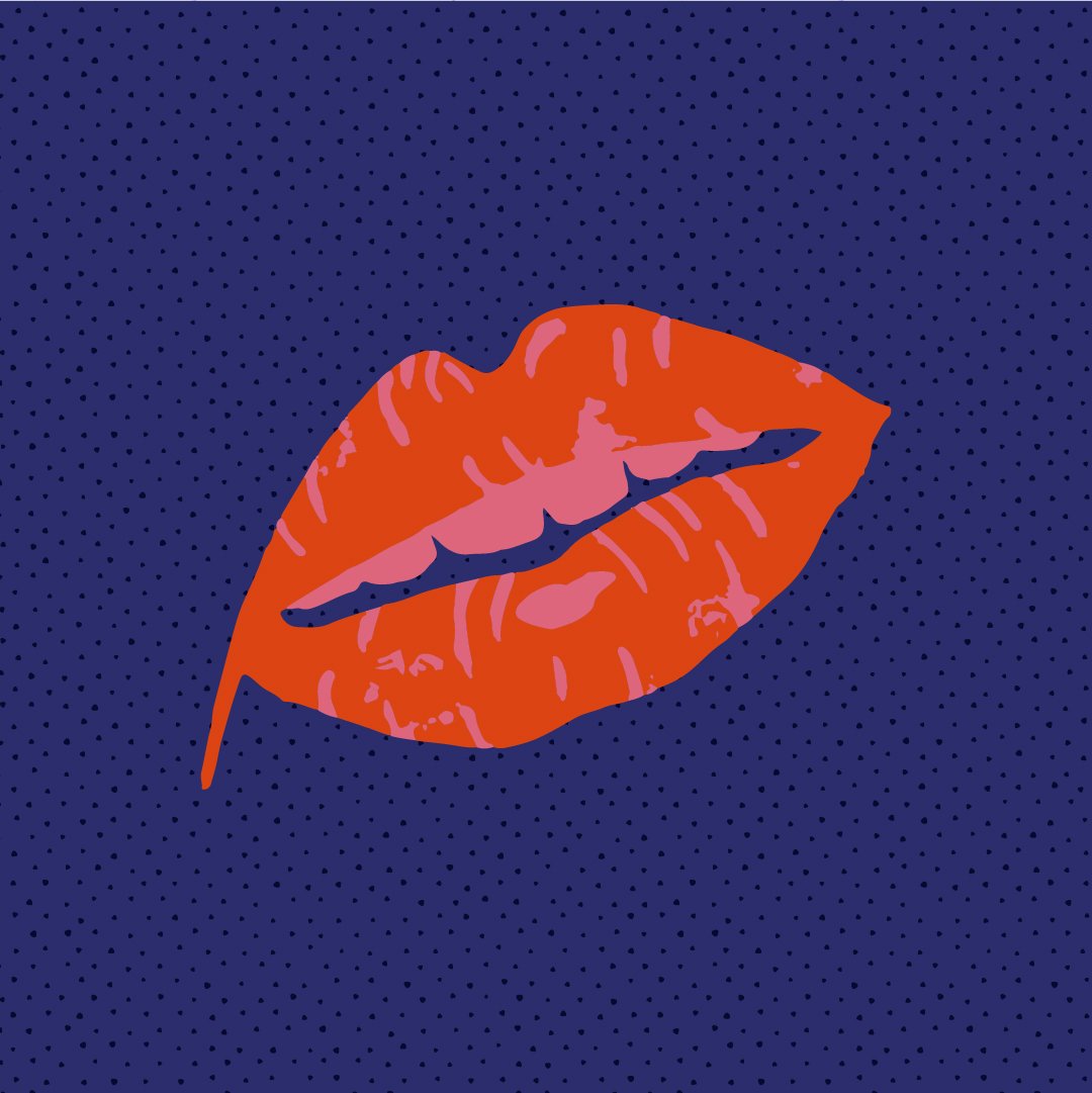
The type is a bit playful, utilizing a fiery red and orange color scheme. There’s a light layer of jungle grunge without being over the top. The snake might seem aggressive and dangerous at first, but its forked tongue forms the shape of a heart. Appearances can be deceiving.


Lower third animal icon design direction for Fiery.
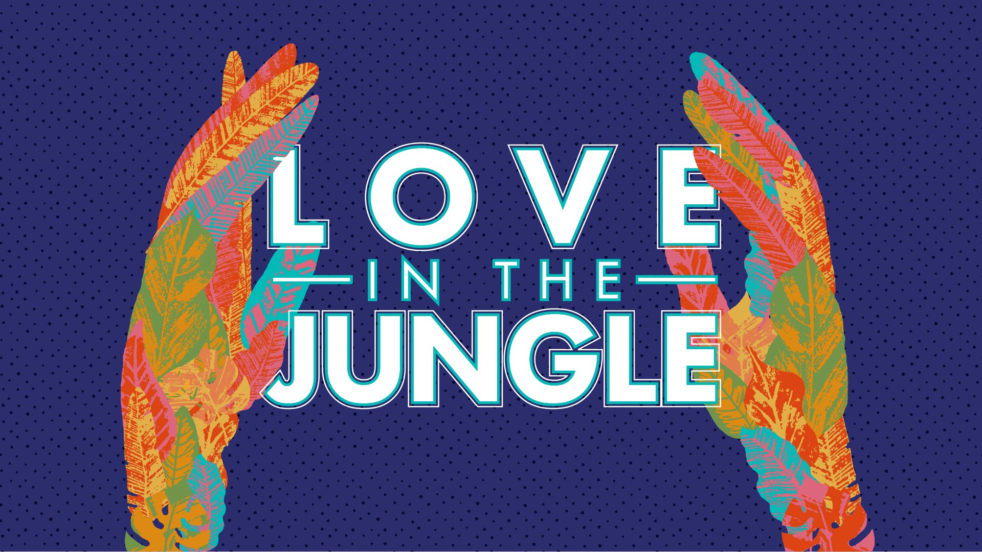
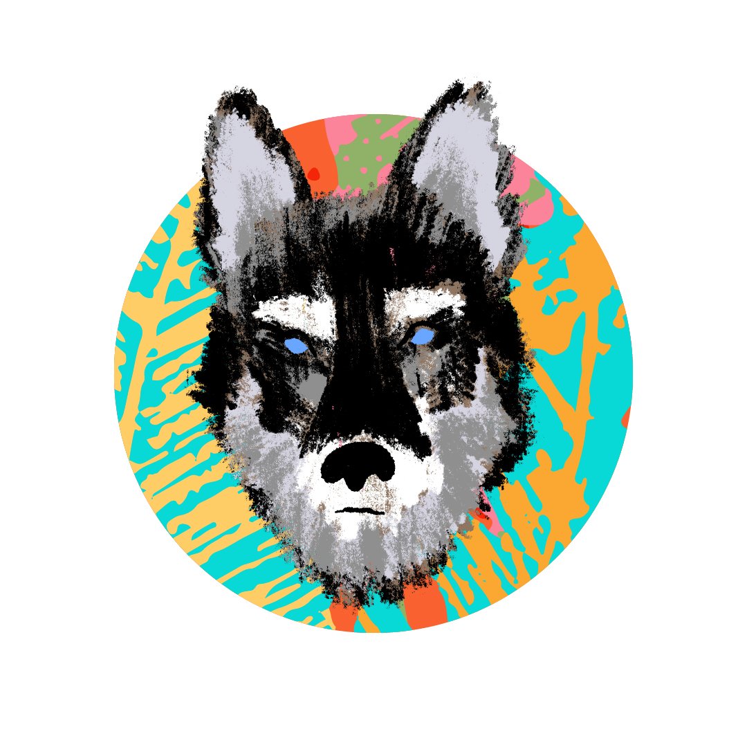
“Modern Pop” Title Direction
A flood of colors combine to create a Warhol-inspired vision of the jungle. Hyper graphic combinations bring a high level of energy to the design.

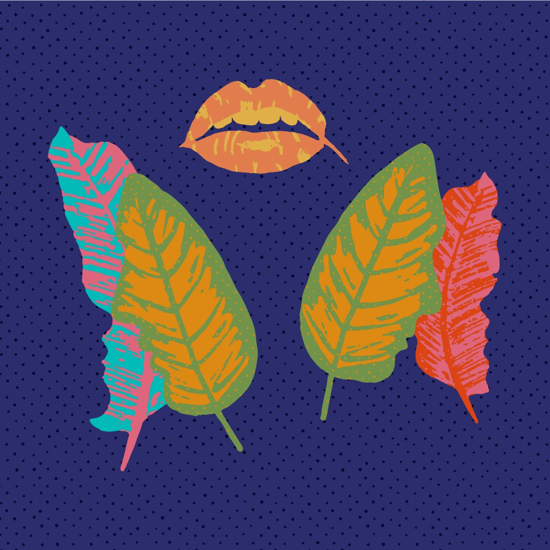
There was a concern that the concept was missing a human element so new leaves were designed in the shape of kissing faces, as well as mouths and lips. I even tried a few options of touching hands made from the jungle leaves. Some really interesting visuals came out the exploration, but after a few rounds of revisions they ended up passing on it.


Lower third animal icon design direction for Modern Pop.