Laurel & Wolf
BRANDING & VISUAL IDENTITY • LOGO DESIGN • CREATIVE DIRECTION • ART DIRECTION • PRINT DESIGN
Laurel & Wolf is an online interior design company based in West Hollywood, CA.
A brand identity should never feel like it just came off an assembly line. It needs to tell you a visual story about the company and what went into its formation. Every brand's origin is unique and its identity should speak to that. I like to discover the heart and soul of a brand and put it on display for everyone to see.
We created a new identity for Laurel & Wolf because the previous one lacked a connection to the brand's origins. It was a logo created out of convenience – not out of passion. The company needed a logo and it "worked." It just didn't do a good job of telling people who the company is. If you don't know who you are when you present yourself to the world then how are you supposed to expect that customers will know and remember you we are? You can't be a remarkable brand if nobody remarks about you.
Secondary stacked logotype
We went back to day one. How did the idea for the company come together? What were those first months like? Where did the name come from? Hours of interviewing CEO and Founder Leura Fine led us down a path toward a canyon in Southern California and the interior decorator, Elsie de Wolfe.
Those who live in Los Angeles are very familiar with canyon roads, especially those who live and work in West Hollywood. The "Laurel" in Laurel & Wolf comes from Laurel Canyon. We embraced the fact that we are a Southern Californian company by including it on our name. The "Wolf" comes from the name of the famous interior decorator, Elsie de Wolfe. Her work had an impact on our CEO and Founder's work and she wanted to include her in our name as tribute to her groundbreaking work in the field.
“Vintage. Classic. Trusted. Bold. Confident.”
These were all phrases that came up when talking about how the brand should be perceived. The previous logo was lowercase and casual. It didn't speak to any of those phrases and looked and felt juvenile in comparison. The brand needed to grow up. I immediately went to the work of Elsie de Wolfe for inspiration. Contemporary and classic typefaces were played with, but we were all drawn to a classic, condensed serif for the new logotype. It inspired trust through its historic look, yet still felt very contemporary in its application. Its weight is bold and in turn its voice can be bold. The company is now confident in who it is as a brand when it presents itself with this logotype and we have built a consistent visual language around it.
The Ampersand mark
The L&W initials
The one element we wanted to carry over to the new identity from the old was a unique ampersand. The previous logo had a quirkyness in its odd ampersand, so we concentrated on creating a custom ampersand for each idea during the identity exploration. We also really liked the idea of the ampersand becoming a symbol of the bridge between the services we offer (we design bedrooms "&" living rooms "&" dining rooms "&" etc.), the combination of styles we work with (industrial "&" traditional, eclectic "&" contemporary, etc.) or the connections we can make (client "&" designer, you "&" me, etc.).
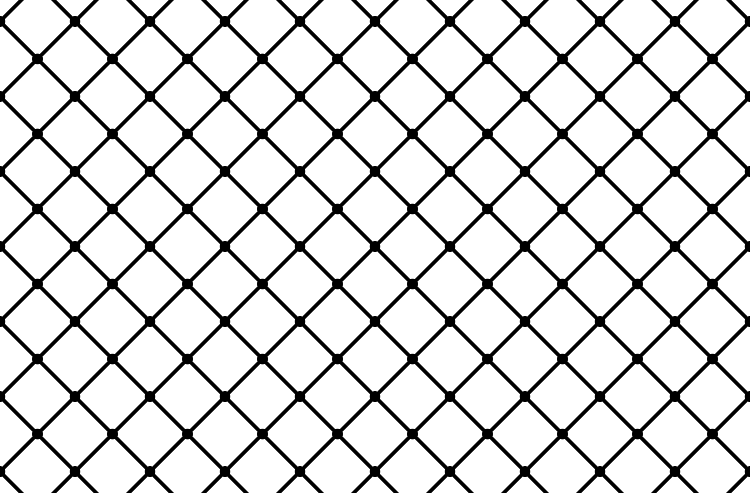
The Diamond pattern
The Diamond pattern takes its cues from vintage upholstery fabric patterns that were encountered during the discovery phase. It can also be used as a container for the logo, marks or even photos in certain cases which allows it to be a incredibly versatile piece of the identity.
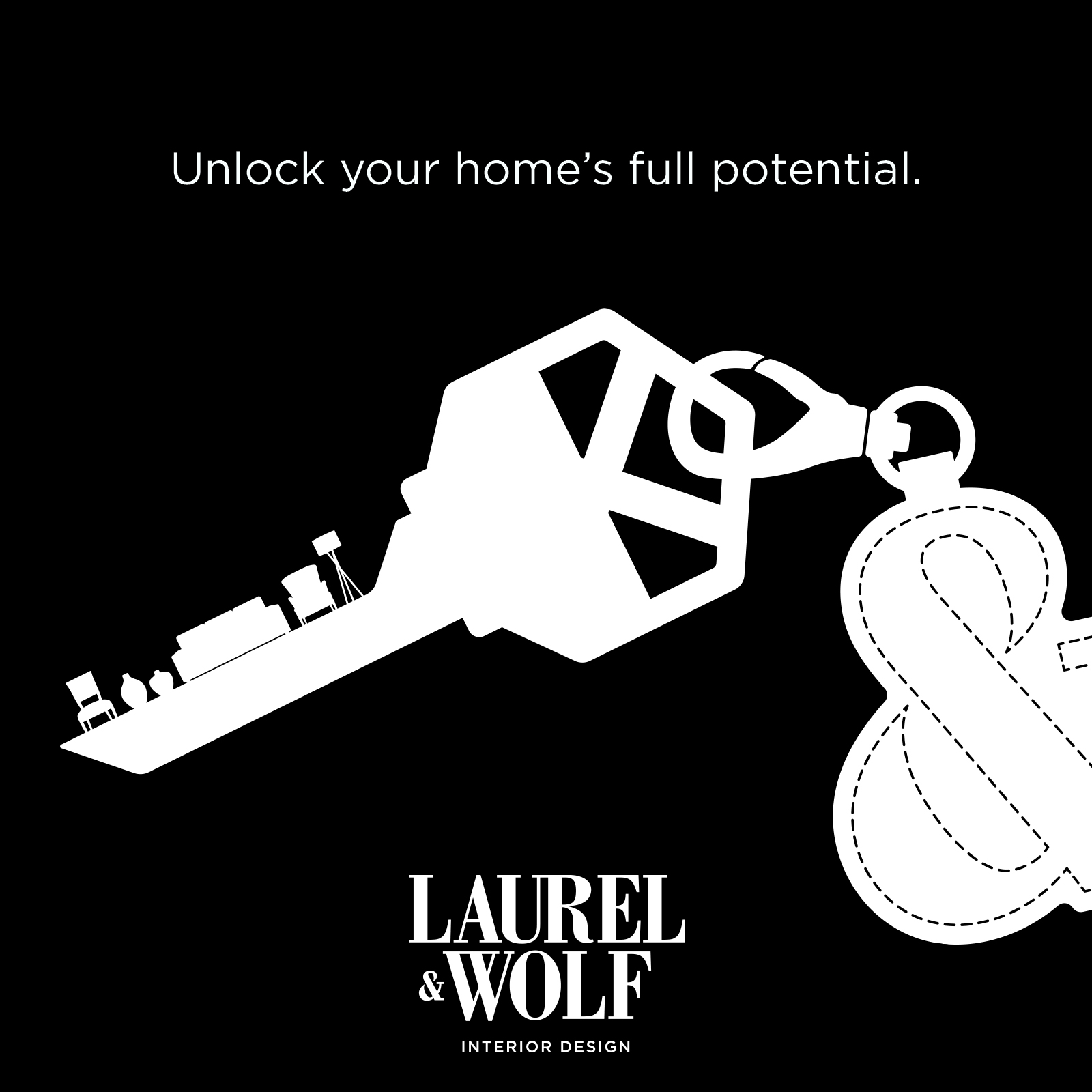
"Unlock Your Home's Full Potential" Campaign
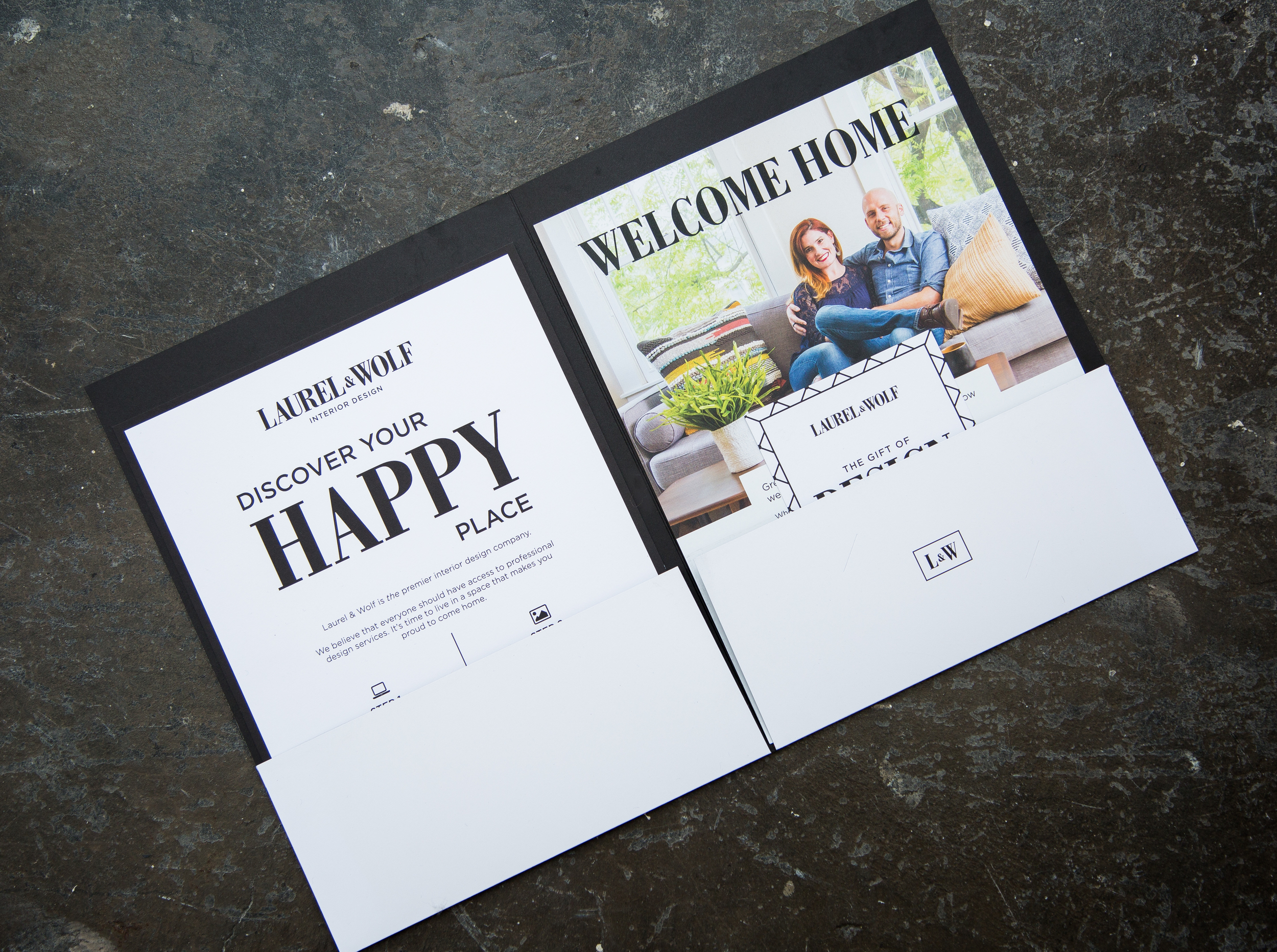
Sales Kit Materials
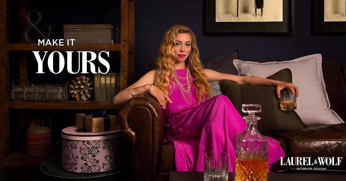
Facebook Ads
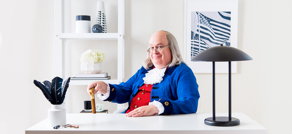
4th of July themed ad
Back to School
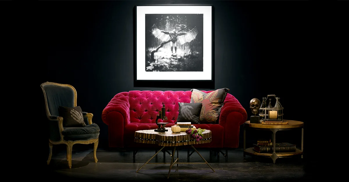
Halloween Concept
Halloween
"Inspiration" Video Series
"Food"
"Baby"
"Travel"
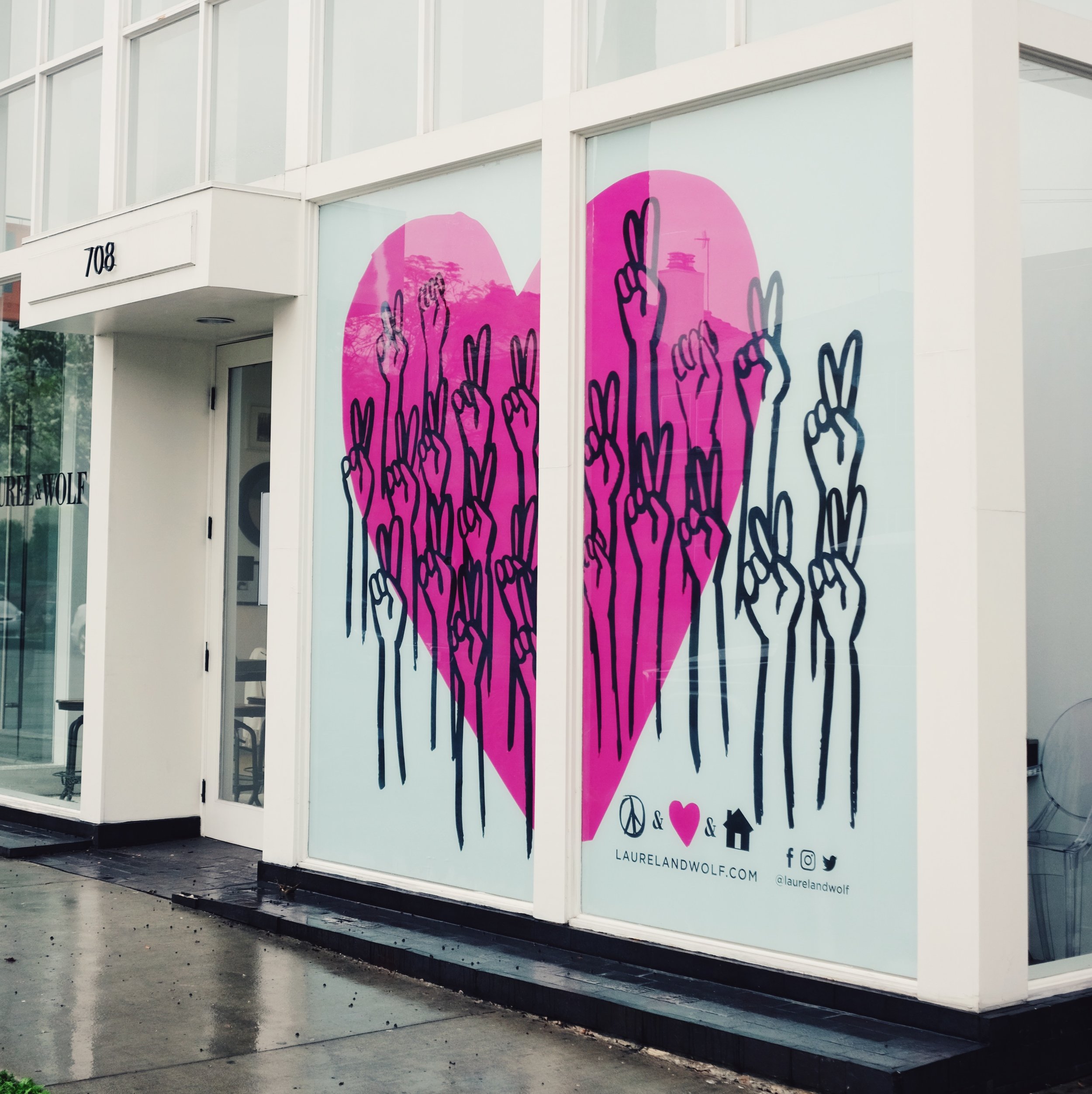
Valentine's Day 2017 Window Mural: "Peace & Love & Home"
Floral brand pattern
Pride 2016
Sticker design
T-Shirt design

